In 2015, after serving as Art Director for Electric Zoo, New York's electronic music festival, since its inception in 2009, I became the festival's Creative Director. This meant that in addition to the responsibilities I'd had as Art Director (overseeing the look of the festival's promotional materials, credentials, merchandise, and signage as well as designing most of those materials myself, with the great support of illustrator/assistant designer Mike D'Angelo beginning in 2010), I would now also have the great pleasure and daunting task of overseeing the look and creative experience of everything that happened when people walked through the festival gates. With the support and guidance of Jeroen Jansen of ID&T, as well as a stellar in-house team and a network of outsourced specialists, I set about trying to breathe new life into a festival that had been beleaguered by two consecutive years of canceled final days of the event and the negative press and attendee frustration that came from misunderstandings about why those cancelations had occurred.
A Bit of Background
Attendance for Electric Zoo had been growing at an ever-increasing rate from 2009-2013. In 2013, the festival added a second main stage and expanded into a larger footprint on Randalls Island Park. Unfortunately, on the morning of September 1, 2013, the third and final day of the festival was canceled. This was fallout from the drug-related deaths of two attendees. Taking place in a public park, the decision to cancel wasn't taken lightly nor in isolation - there are a number of city agencies that need to be kept happy in order for an event like this to take place year after year. However, though refunds were issued to ticket-holders, many who had set aside that weekend in their calendars for months in advance and had spent hundreds of dollars on transportation and accommodations in New York City felt that a cancelation was unfair to them and unwarranted.
Unfortunately this had a significant impact on sales in 2014, and in an effort to cut costs, the 2014 production was scaled down. There were still two "main stages" plus 4 additional stages that had originally been planned to fit into the larger site footprint from 2013, but part of the extreme cost-cutting measures included squeezing all of those stages back into the original pre-2013 site footprint. Stage sizes and audio-visual production were noticeably scaled back. To top it all off, a quickly moving storm with high winds, heavy rain, and lightning ripped through the site in the early afternoon of the third and final day of the festival, forcing an evacuation and subsequent cancelation of the remainder of the day. Perhaps because the storm moved through so rapidly and the sun came out quickly thereafter, many thought they should have been allowed to re-enter the site, not taking into consideration the potential impact such high winds and lightning strikes can have on the stability of festival tents and other temporary structures. Nonetheless, the damage had been done, not just to the festival site and the spirits of those evacuated and turned away from re-entering, but to the Electric Zoo brand reputation.
There was also a strong direct competitor that had entered the local market, in the form of Electric Daisy Carnival New York. One of the original and longest-lasting large event brands focused on electronic dance music in the US, Electric Daisy Carnival brought serious competition to New York City - very strong artist lineups paired with an over-the-top level of pyrotechnics, creative main stage designs, carnival rides, art installations, and costumed performers. What they didn’t have was a beautiful park venue, and they instead had to settle for stadium parking lots. But their promo videos and websites have always been a feast for the eyes. They were also growing every year, and it made me feel that Electric Zoo needed to offer a more complete experience and a more visually stimulating environment filled with opportunities for attendees to take photos and videos they’d share with their friends on social media.
Electric Zoo: Transformed
Shortly after Electric Zoo 2014, our team met to talk about how to turn things around. It was my firm belief that we needed to breathe new life into the festival through a new creative vision and message. I had previously identified what I felt were the brand's core differentiating characteristics, what Electric Zoo meant to the people who were familiar with it. Among these characteristics was Transformation - this was a place where people came to let themselves feel free from everyday burdens, perhaps wear a costume, lose themselves in the music, meet new people, and come away from the experience feeling reinvigorated, recharged, transformed.
As a team, we knew we had to transform, too - we had to look at the way we had been approaching every aspect of the festival and ask ourselves how it could be done differently, while staying true to the core principles that helped the festival grow so strong. We settled on the name Electric Zoo: Transformed, and we decided that the theme of transformation would be the driving force behind everything we did that year.
To breathe new life into the festival, we imagined the park itself transforming- the energy of the city and its people, and the energy of the music combining with the beautiful green space of the park and taking shape in giant animal forms. We hinted at this idea with some short teaser animations:
Key Art
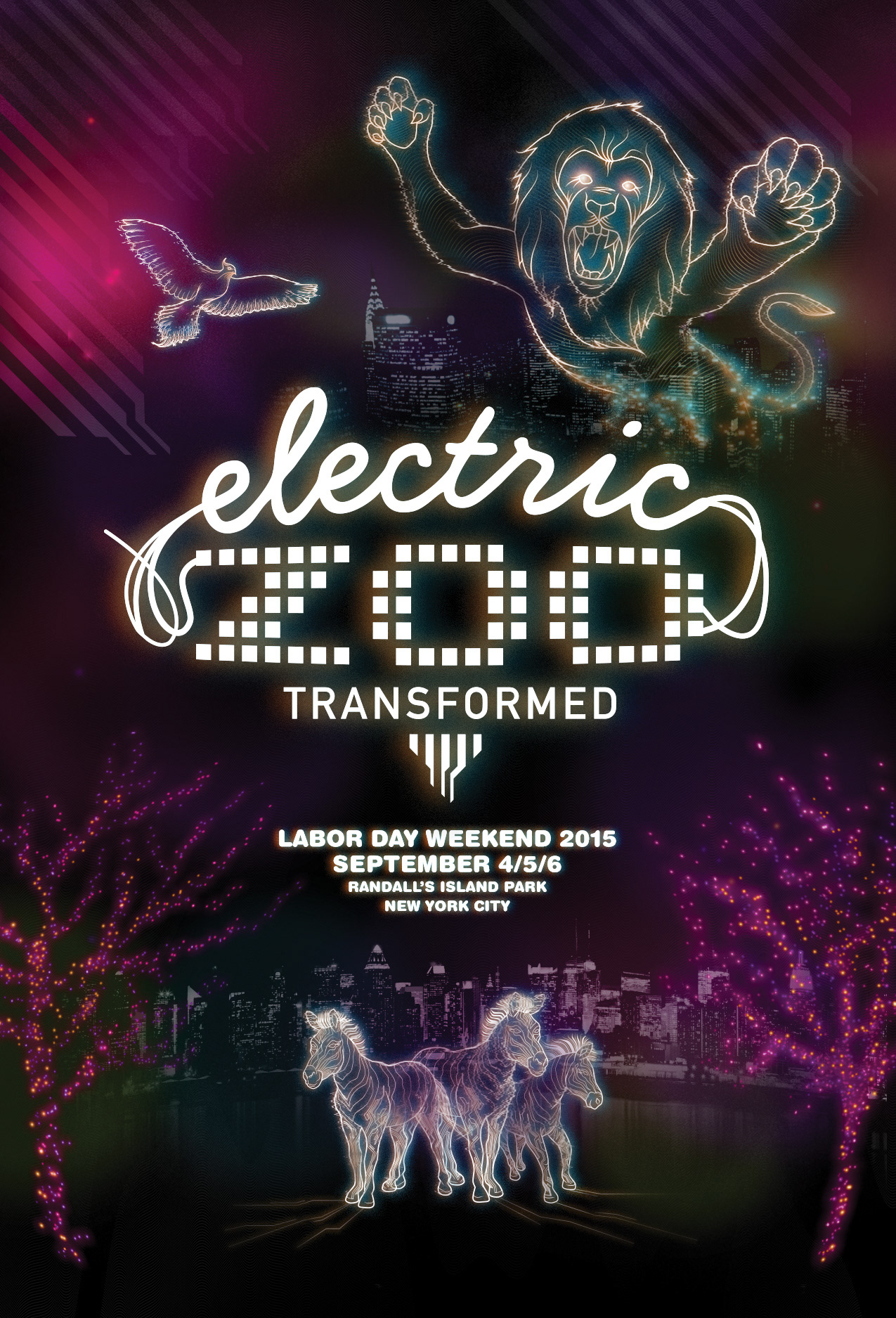
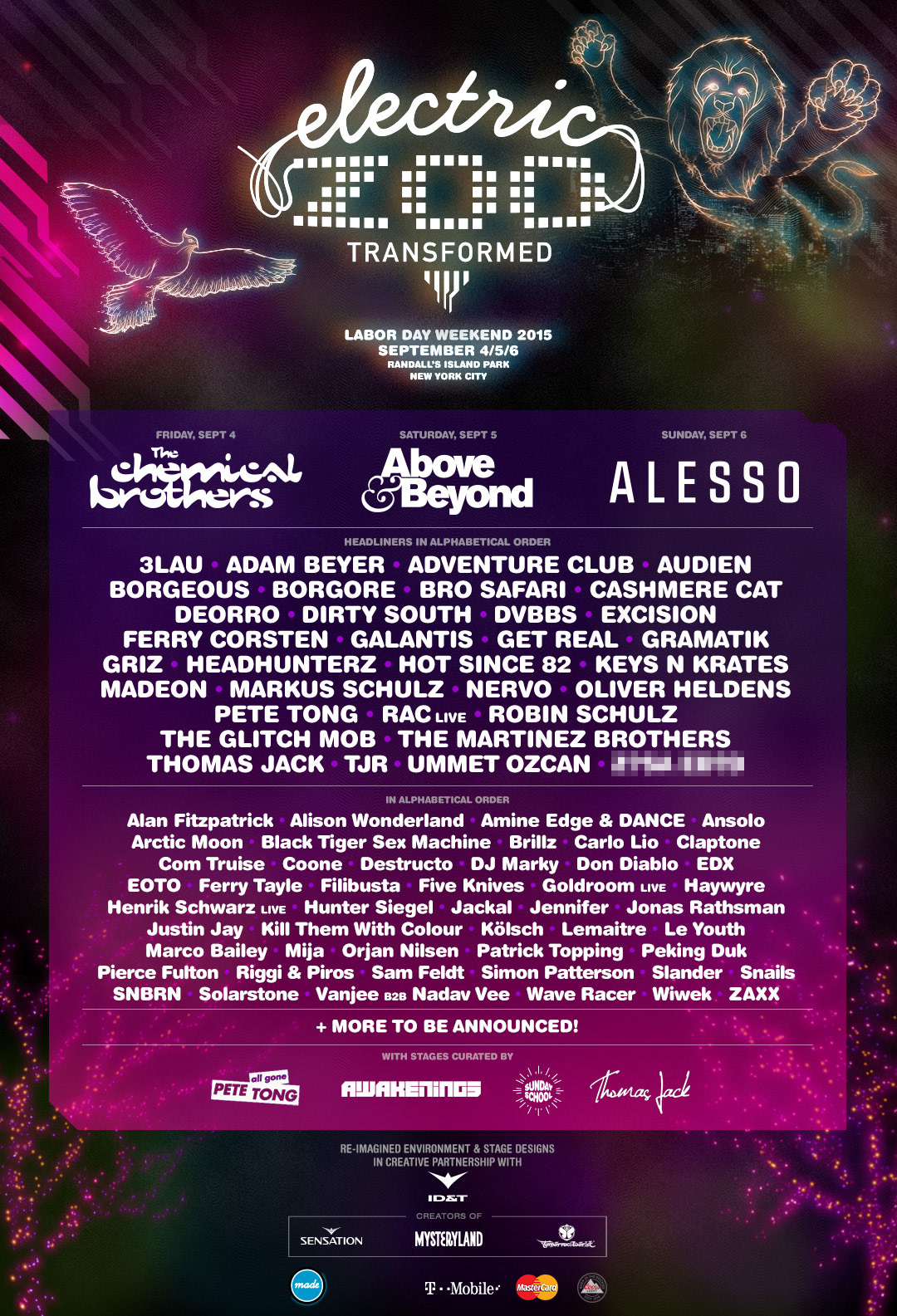
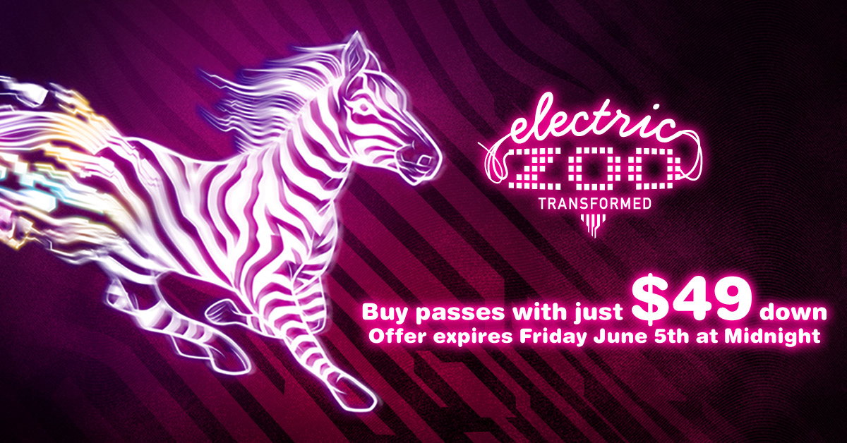
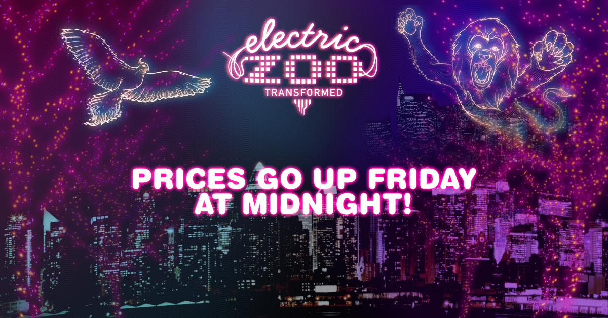
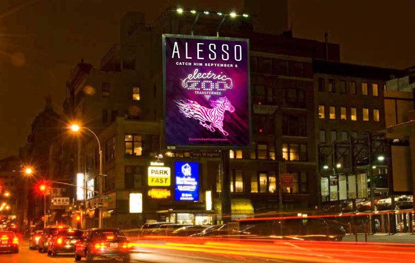
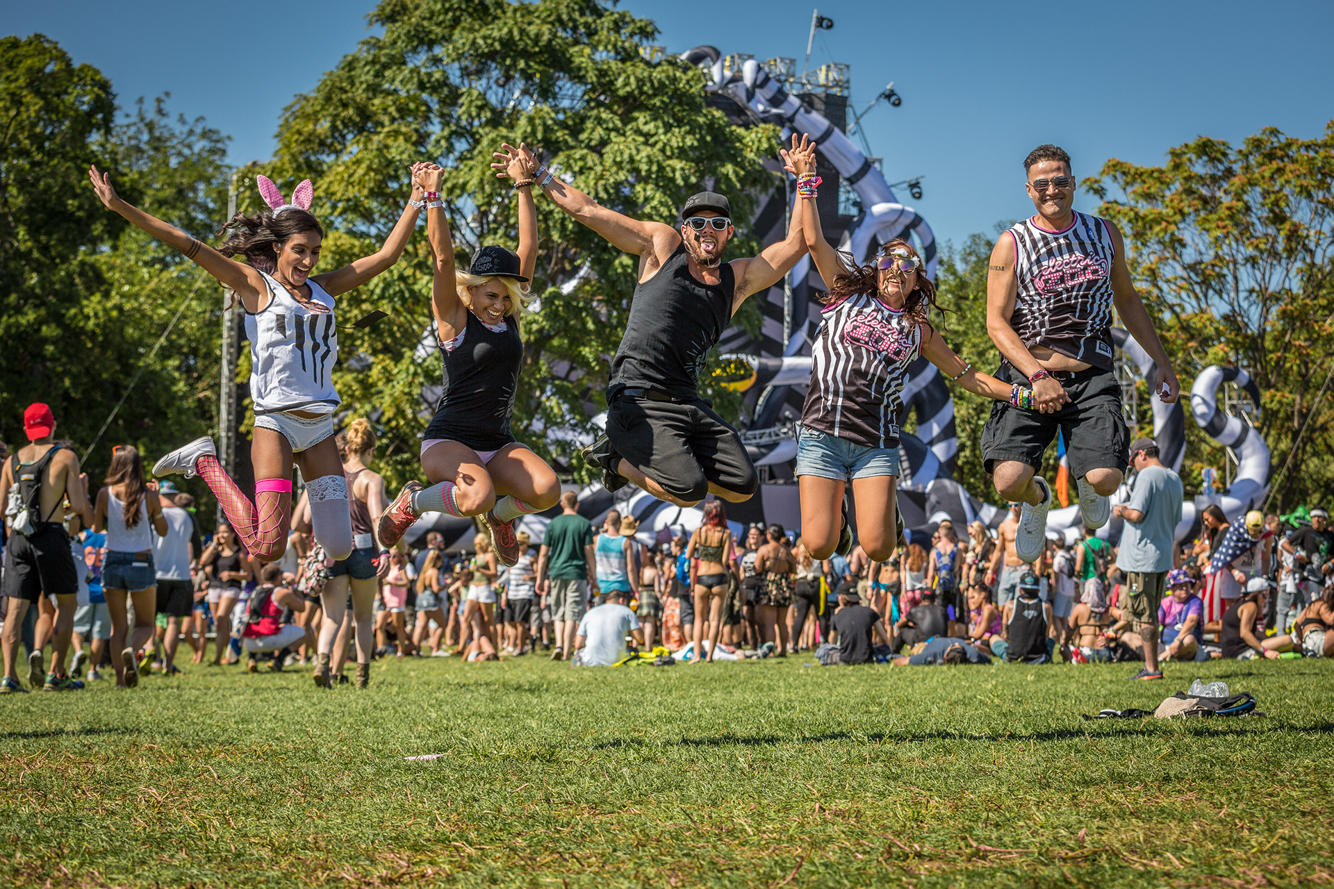
The key artwork used on everything from posters, printed flyers, the festival website and social media, to wristbands and wristband mailers, the official festival booklet, and outdoor advertising, included imagery based on this idea of transformative energy carried through animal forms. A "digital zebra stripe" background element was used throughout these assets as well, carrying the concept of the electronic world melding with the animal energy.
Stage Designs
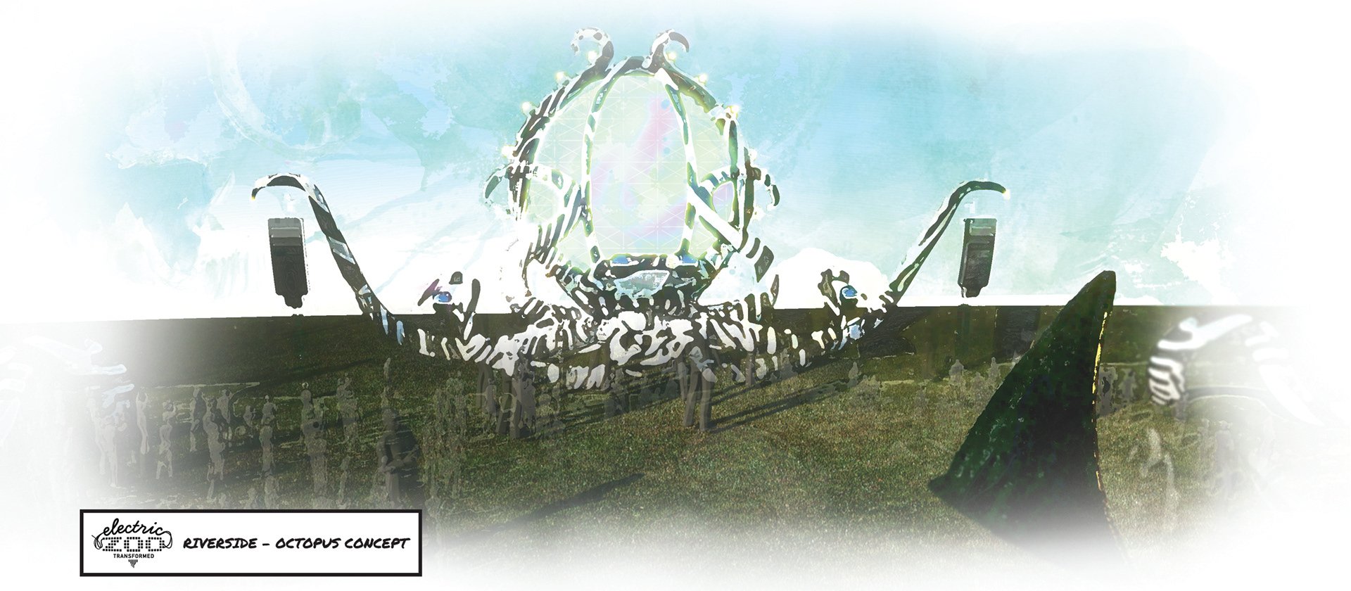
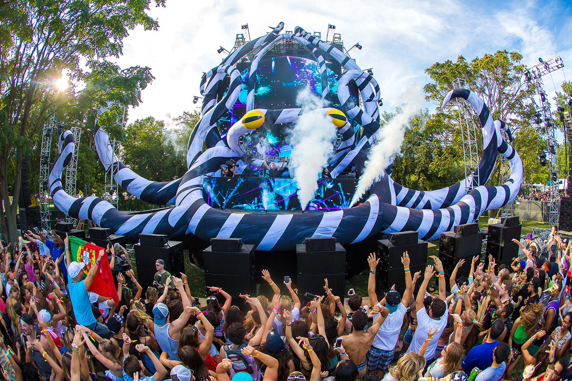
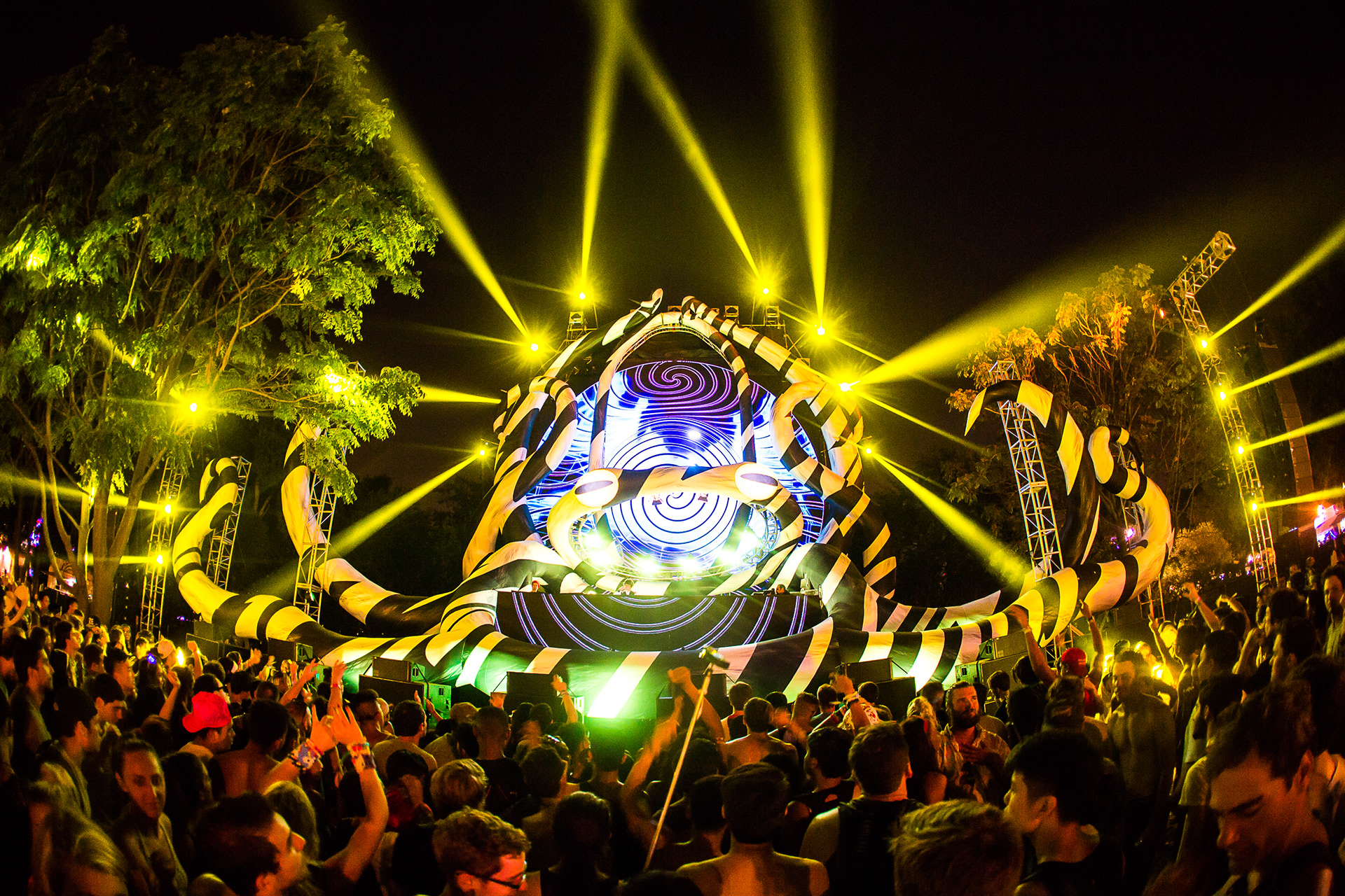
I created and delivered a production design brief that provided an overview of the festival's history, the important role played by the green space in the heart of New York City where it takes place, and some design principles. I wanted to see stage designs based on giant animal forms, with a theme of transformation. I wanted to keep the look modern and/or neo-futuristic, with a strong use of black and white surfaces so we could let LED lighting reflect off of the structures for an ever-changing color impression. I asked specifically for the design of a secondary open-air stage in the form of an octopus. The other stages would be inside large tents and for those we focused more on creating a dark, enclosed club-like environment where people could lose themselves in the lights and sound.
Main Stage: The Phoenix
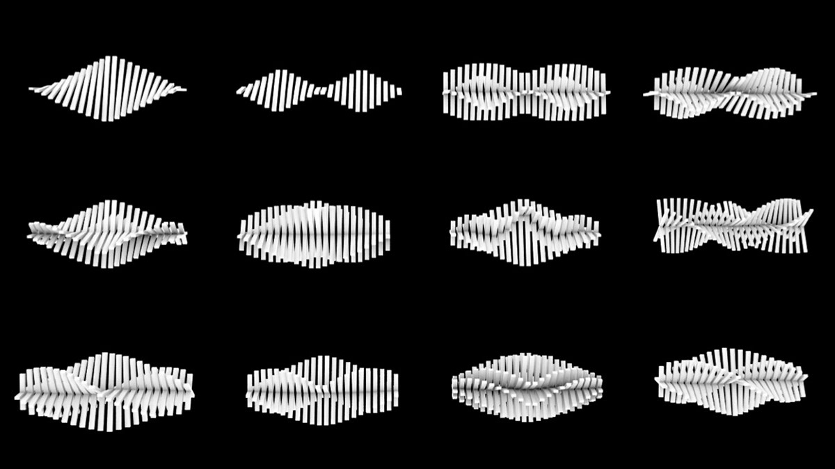
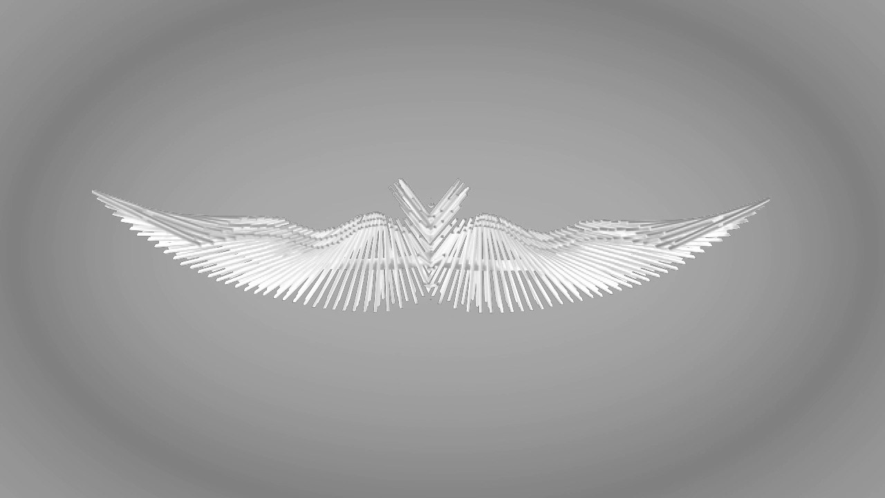
The abstract bird form of the main stage was inspired by the work of architect Santiago Calatrava, who has done a lot of work with parametric design, where he creates gracefully curving forms by building up straight segments of varying lengths. I asked Roy Gerritsen of Boompje Studio to explore this idea.
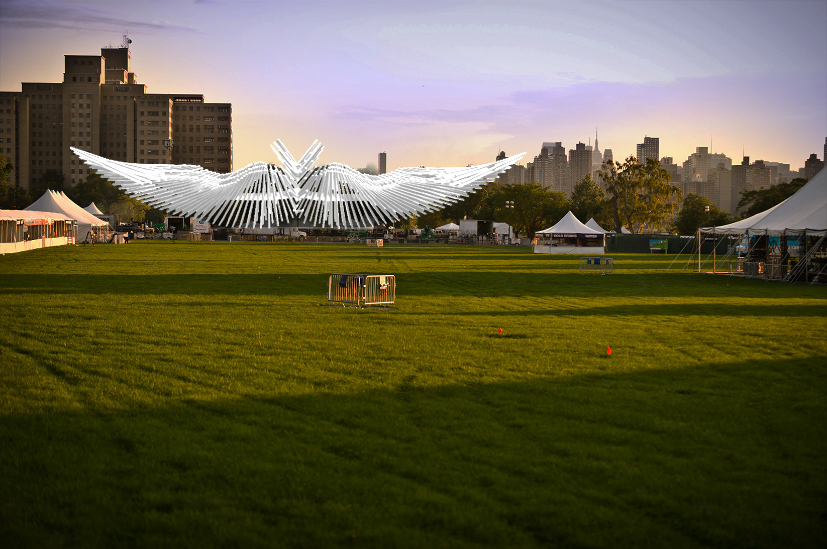
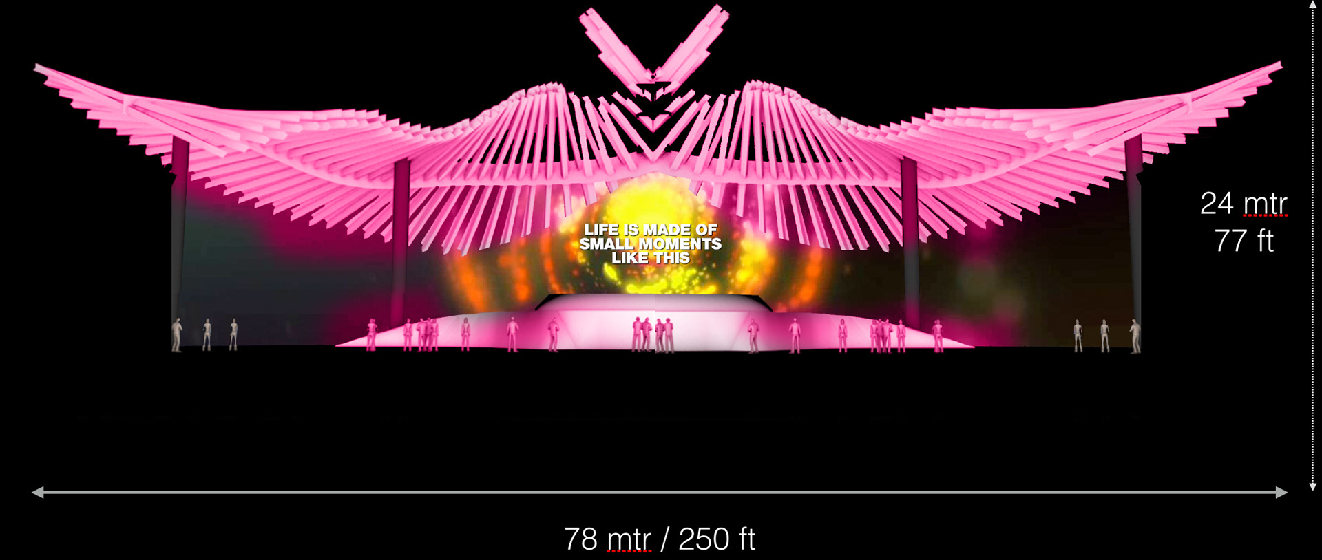
After further refinement from myself, Jeroen Jansen, and 250K, and adjustments to meet a lot of engineering challenges, this is what was eventually built:
Riverside Stage: The Octopus
There had always been a stage inside a tent at Electric Zoo called Riverside. (In the first year, it was the tent that was situated closest to the East River. In subsequent years there were other tents that were also located along the riverside, but there was always one known as Riverside.) When the team met to discuss all of the various changes we could make, our talent buyer Ryan Fightmaster suggested that 3 stages inside tents was perhaps too many, and that we should consider making Riverside an open-air stage. We all liked the idea right away.
So why an octopus? Well, some species of octopus are able to change the color and even texture of their skin to mimic their surroundings. There are even octopuses covered with black and white stripes that are reminiscent of zebra stripes, and with our "digital zebra stripe" as a graphic element we were using to represent the spreading transformational energy, the octopus was a natural symbolic fit for Electric Zoo: Transformed.
We were also beginning to expand Electric Zoo into other markets internationally, including with Electric Zoo Beach, so there was some value in designing a stage that could travel efficiently. The octopus is inflatable, and packs down to a relatively small crate for shipping. We didn't end up using it for Electric Zoo Beach, but it was sent to China for Electric Zoo: Countdown Shanghai, and can still be used for future international editions of Electric Zoo.
Lastly, I liked the idea of creating a connection with the aquatic part of the animal kingdom, for the look of the stage and also the custom video content we created for it. By creating different areas each with their own connection to a certain type of habitat, the festival would have more of a variety of environments all fitting into the zoo theme.
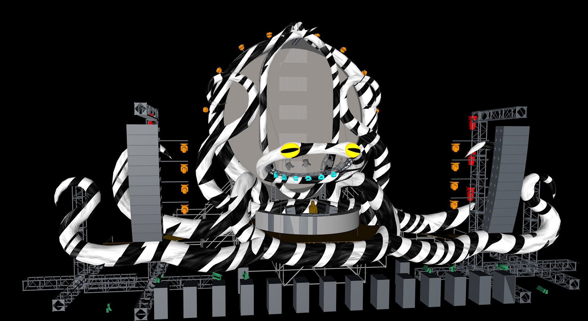
The Vitamin Water Treehouse
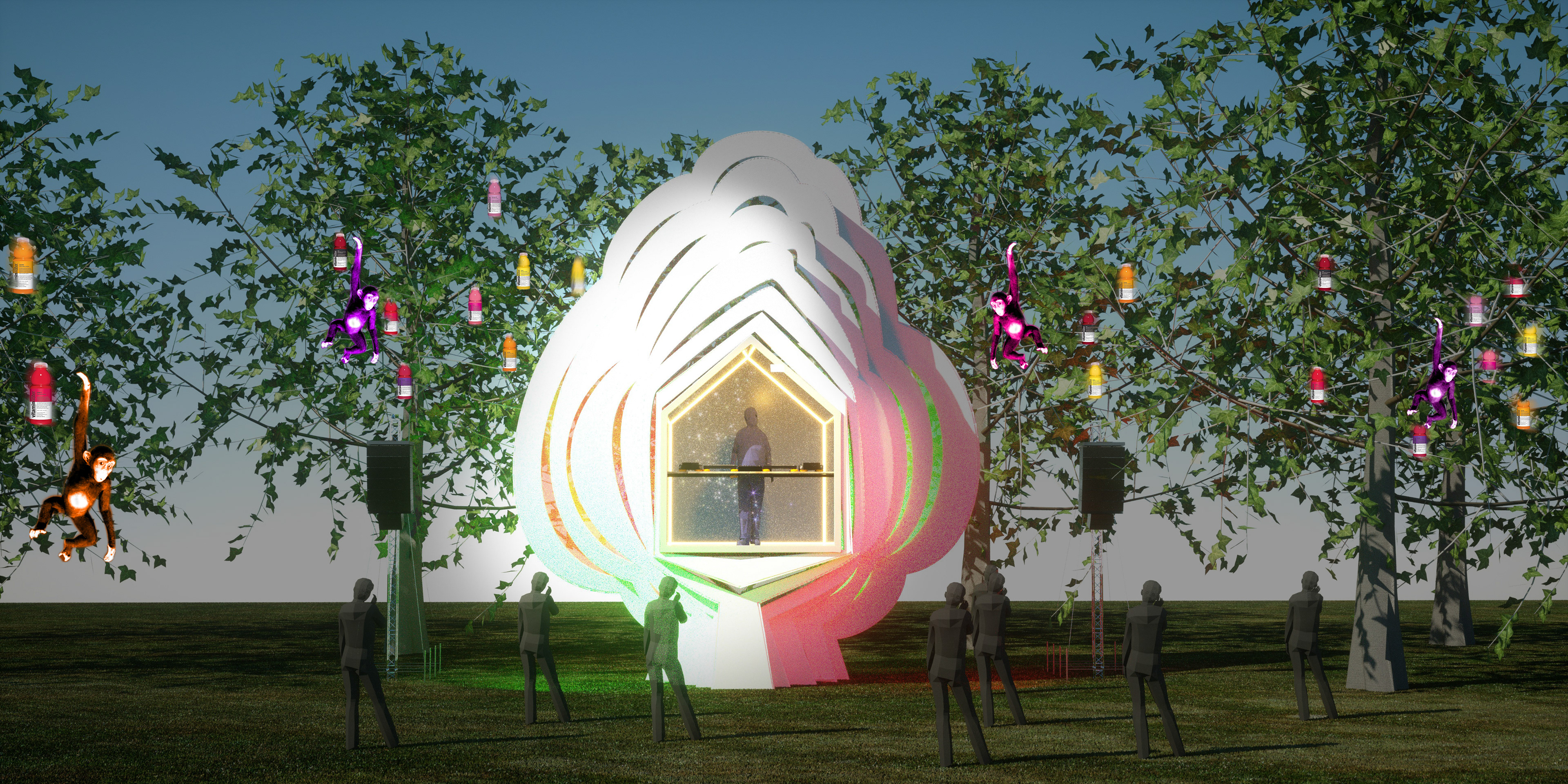
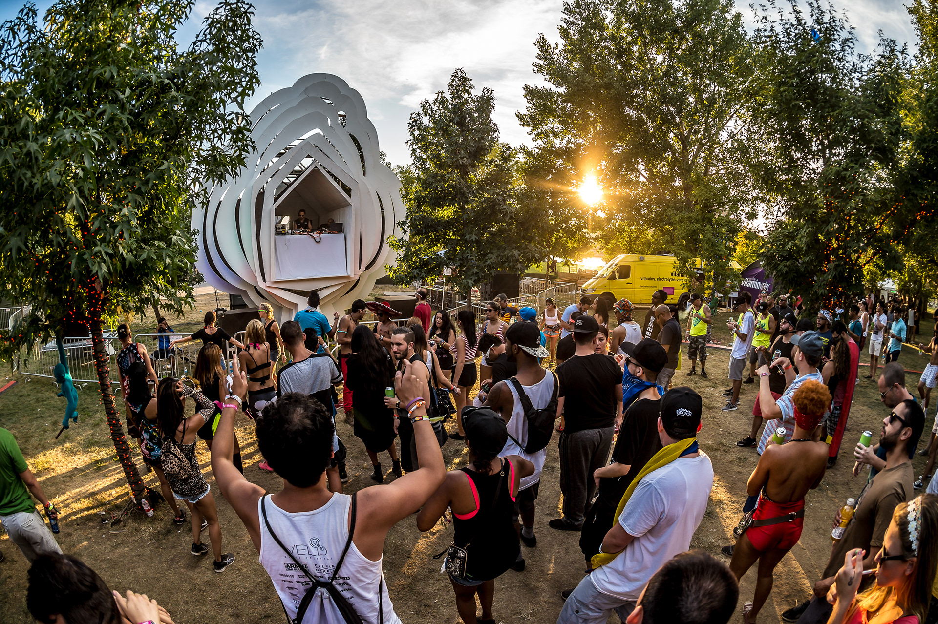
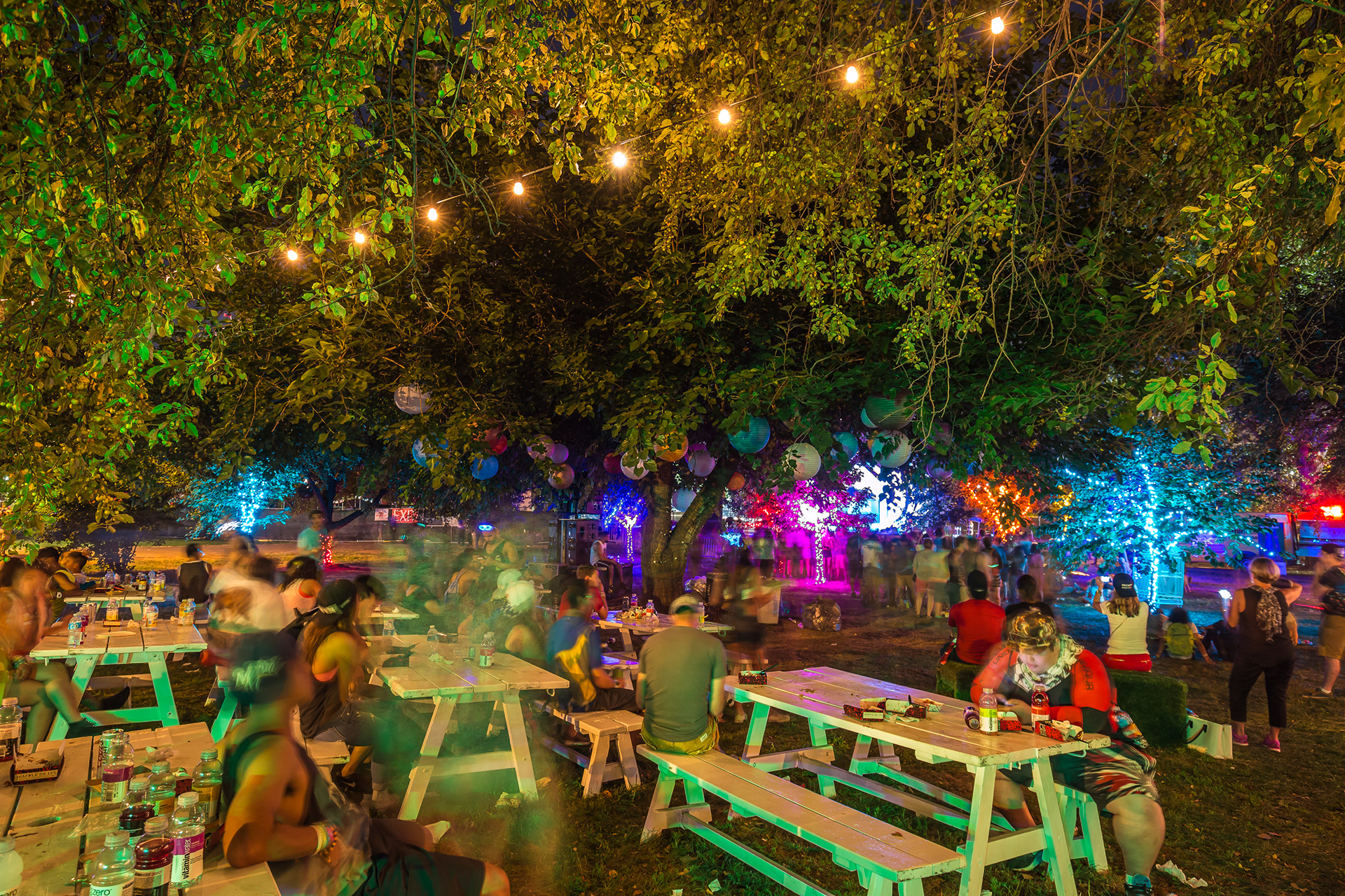
At some point in June, Vitamin Water expressed an interest in sponsoring a small stage for local DJs. We had decided earlier in the year that we should expand the site boundaries slightly from the original Electric Zoo festival plan to include an area of the park near the ferry dock that previously was kept outside of the festival fence line. It was filled with trees and couldn't be used for a very large stage, but it was a lovely shady spot where I imagined putting picnic tables, some art, and comfy seating - a chillout area to get away from the crowd, cool off, have something to eat with your friends. I dubbed it the Hideaway. One corner of the Hideaway was the perfect spot for a little stage for local DJs to play some chillout music, but instead of just putting up a little covered platform with some turntables and CDJs, I thought it would be much nicer to make a DJ booth that was also an art piece that tied into the theme of transformation, and also made a nod to the idea of the festival site being a nexus for mixing the aesthetics of man-made modernity with the green beauty of nature. There was a perfect alleyway of trees that lead to an empty spot. That's where I wanted a Treehouse. But not a woodsy, slapped together backyard treehouse - I wanted something sleek and segmented, to play off the natural green surroundings. Marc Adema delivered brilliantly, with an iconic design - in fact 2 icons melded into 1 form. Boiled down to their simplest, most recognizable forms, a tree, and a house. Painted in white, it stood out during the day as a stark visual statement, and at night it constantly shifted colors under the wash of several LED fixtures.
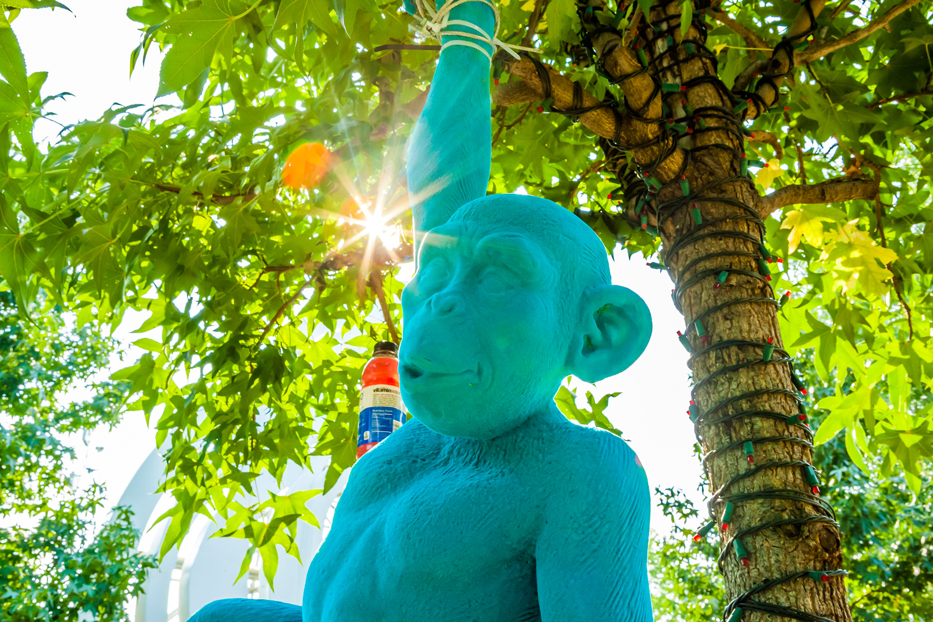
We lit the surrounding trees in Vitamin Water colors and hung Vitamin Water bottles in the trees with tiny LEDs inside them, and we painted fiberglass monkeys in the same color palette and put them in the trees, too. Vitamin Water provided brand ambassadors to hand out free samples throughout the area.
Site Art & Costumed Performers
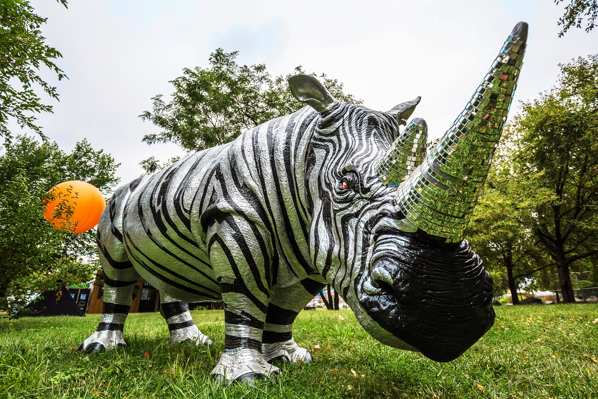
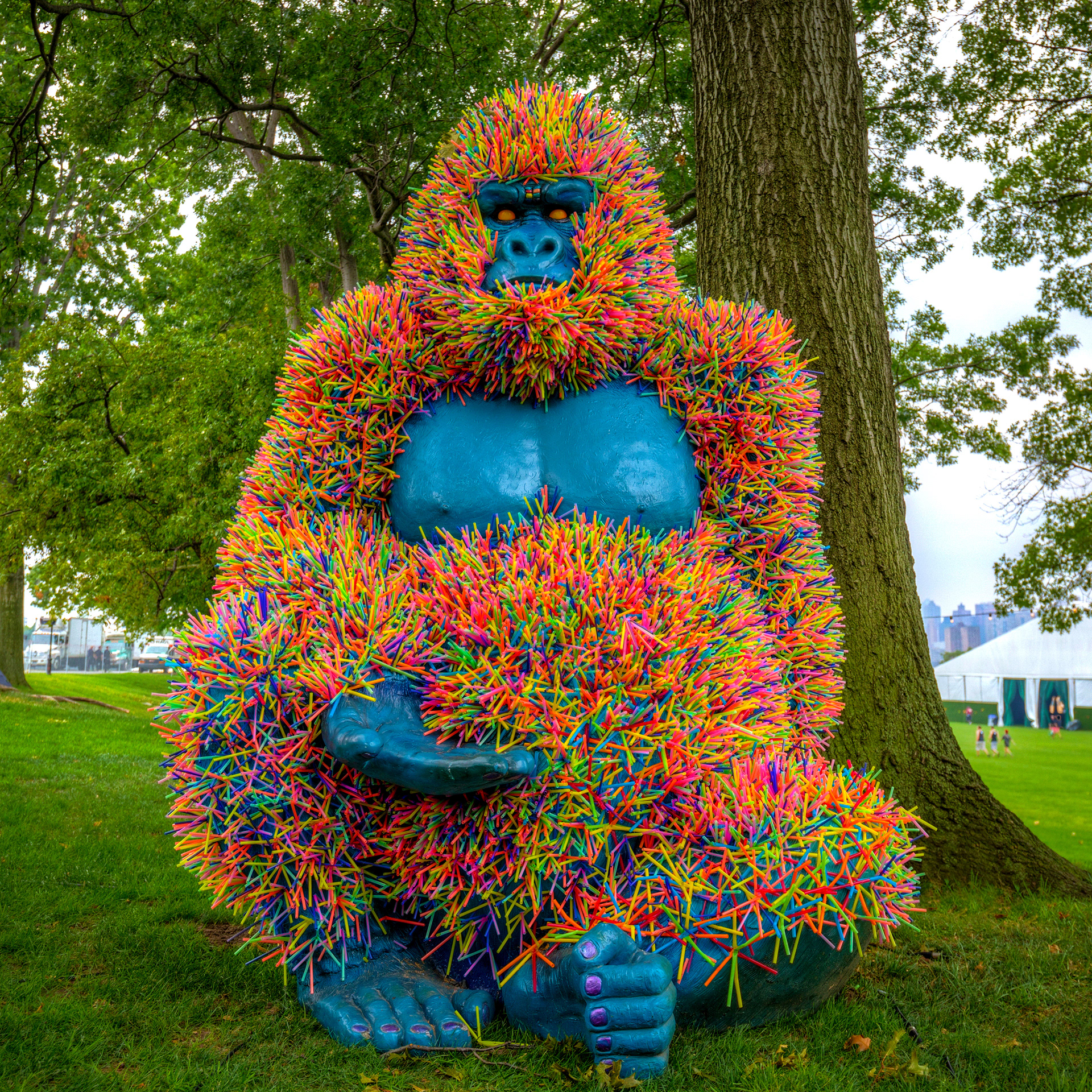
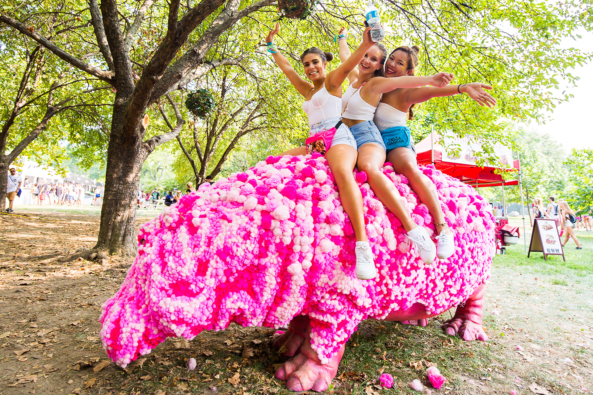
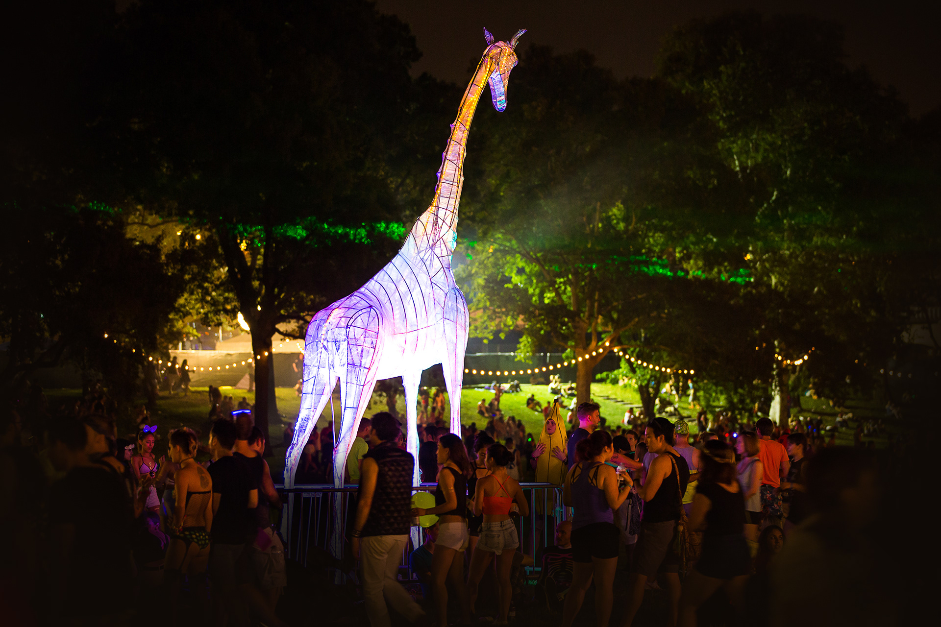
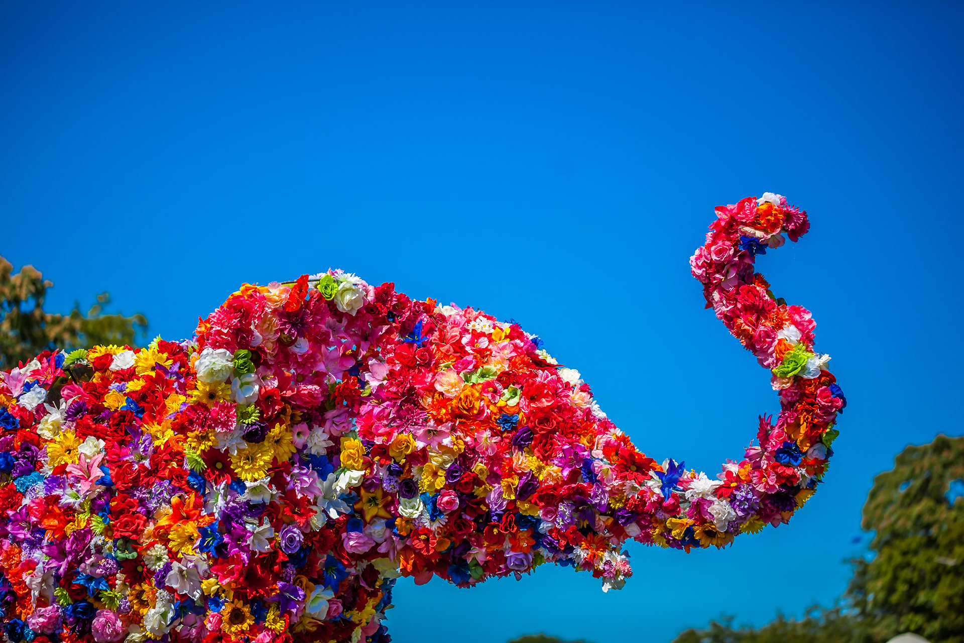
Over the years we had built up a collection of zoo animals that were placed in chillout areas, and we decided to transform these as well, by giving them new surface treatments. I also wanted to add some larger animal sculptures, because a lot of what we owned were small enough that they didn't make enough of an impact in such a large, open setting. Our site art & deco lead, Patty Gutarra, had heard about a sculptor known as Topiary Joe, who’s a very talented artist with a great team around him and an all-around great guy with a fun personality. He made our 18-ft tall giraffe, a 12-ft tall elephant that Patty’s team covered in flowers, and a 30-ft long school bus based on a design from Marc Adema that carried forward a long-standing tradition of having school buses on the grounds to represent the Sunday School area.
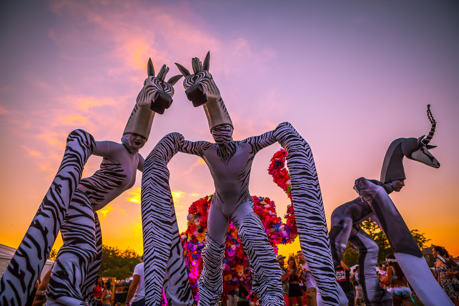
I had met Sean Fountain (Wild Child World) in Miami in the Spring of 2015, and over the summer we talked through a vision that festival founder Laura De Palma and deco lead Patty Gutarra had had in a previous year but hadn’t yet had a chance to bring to fruition, which was a herd of graceful gazelles and zebras with elongated legs roaming the site. Sean sketched these out based on our conversations and crafted them beautifully, as well as provided the performers and directed them.
Merchandise
I oversaw the design of all official festival merchandise, and in the case of a few pieces I'm responsible for the design from concept to press-ready set-up.
End shows
We finished off each night with an end show at the main stage. These were a way to send everyone off with a final moment from the festival, an audiovisual spectacular with special effects and fireworks. I wrote the scripts for each of these and oversaw their production from a creative standpoint.
Live stream
Electric Zoo: Transformed was live streamed as part of a sponsorship deal with T-Mobile. Corrino produced the live stream, complete with a package of pre-produced content, mood reels and bumpers made from our key art. I provided creative direction for the types of pre-produced content I felt would best frame the concept behind Transformed, and I provided art direction for the mood reels and bumpers.
Aftermovie
Justin Hamilton (Navigate) directed and, with his team, shot and edited the official aftermovie for Electric Zoo: Transformed. Justin was a great creative partner of the festival's for many years, and 2015 was no exception. He came to us with a concept for the editing style and sound design that we loved, and did a fantastic job executing the idea. I gave him guidance to make sure we were capturing and showing all of the aspects of the festival experience, since that experience had become so much richer than it had been in previous years, and I'm sure I had some specific feedback on shot selection here and there, but most of what you'll see below is the result of years of Justin knowing the festival and how to capture its energy. Leo Melcherts did a phenomenal job with the sound design, and Boompje Studio provided the special effects.
Creative Direction, Art Direction, Graphic Design: Jeff Wright / Recursion Creative
Illustrator: Mike D'Angelo
Additional Graphic Design & Motion Graphics: Boompje Studio
Main Stage Design: Boompje Studio, Jeff Wright, 250K
LED Show Content & VJing: Eyesupply
Light Design: André Beekmans / The Art of Light
Octopus Stage Design: Marc Adema / Monox
Octopus Inflatable Fabrication: Airworks
Treehouse Design: Marc Adema / Monox
School Bus Design: Marc Adema / Monox
Site Art & Deco Lead: Patty Gutarra
Zebra, Elephant, and School Bus fabrication: Topiary Joe
Zebras & giraffes costume design: Sean Fountain / Wildchild World
Live Stream Produced by: Corrino
Aftermovie Directed & Produced by: Justin Hamilton / Navigate
Sound Design: Leo Melcherts
Special Effects: Boompje Studio
In addition to everyone mentioned above, I'd like to thank Made Event founders Mike Bindra & Laura De Palma for creating the opportunity and entrusting me with their baby; Jeroen Jansen for the enthusiasm, encouragement, endless advice, and generous sharing of his time, knowledge, and network; Marketing Director Michael Julian for always being a great creative partner, Marketing "Dream Team" Joey Sutera and Dmitry Petrov for the encouragement, tireless hours, and creative input, festival director Morgan Deane for always saying "Sure, let's go for it" and keeping the wind in my sails at critical moments; festival co-director Adam Richman for helping to fight to keep the dream alive; and Jordana Kalmanowitz, Liz Walaszczyk, and Attila Meijs for creating an uplifting and energizing environment for developing live stream ideas.
